
Has something changed with the Deck tags? I went through an updated nearly all my lists and I realized that the spacing of the cards and columns is off. In a couple lists, there is no third column at all (see Karador and Volrath) whereas others like Windgrace and Yoshimaru only have a few cards in the third column.
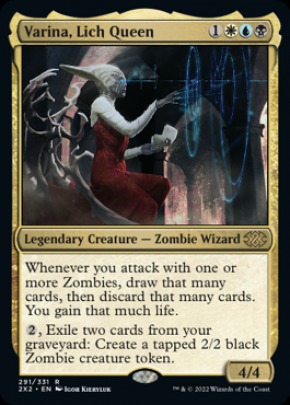
In a few others, the breakdown looks more or less correct (except for a few stragglers at the end of the of the second columns making it look weird) but then there is a bunch of empty space at the end of each column. See Varina and Sygg. Has there been logic that has changed when/how the lists break out to 3 columns that I should be accounting for? Or is something else going on in the background to cause the weird display issues?
Notably all look more or less fine on Mobile. Only two columns, but I am guessing that is correct, and the only blank space is at the bottom of column 2 because there aren't enough cards to fill that out. I only see a real issue on desktop.
Deck Lists Column issues and blank spaces


There hasn't been any changes.
Volrath has 3 columns for me. This is "correct" because the creatures column is so long, it negates the need for a fourth (the other two columns are still shorter, so pushing something to a new column doesn't remove any vertical space). It won't wrap a section across columns (at least in most browsers, column wrapping isn't entirely standardized across the browsers).
Sygg has four columns for me. There's some blank space in the shorter (column 3) one for me, but again, this seems "correct" because it's simply a matter of the other two columns being so long (again, one section each).
If you're a stickler for having things more even, you'd have to break your larger groupings down.
(ie: Decks with 40 creatures will have columns at least 40 lines tall unless you break creatures down into smaller groups)
I've reset the cache just in case something wasn't "fresh".
To the beaten, the broken, or the damned; the lost, and the wayward: wherever I may be, you will have a home.
I tend to break out columns after 39 entries if possible (that is why I have the orders I do so that the forum software can do what it needs to). At least, it has always worked out well for me in the past in terms of the display.
I am not sure how you are seeing them as "right" though. I generally view them in Chrome but just tried them in Edge and see the same thing. Attached is what I see with Volrath. I tried a F5 and a Ctrl-F5 refresh to ensure everything is refreshed. I haven't tried clearing my cookies/cache yet though so I can try that if needed.
Another point is that I have never seen 4 columns in any of my lists, even before today though part of that might be because I tend to not have my browser at full screen most of the time. For the screenshot below, and my testing, I ensured I had it at full screen just to be sure though.
- Attachments
-
I know Chrome doesn't seem to like four columns so much, but was getting 3 for all of your decks.
That said, I've changed how it did things, which is less nuanced, but should hopefully be more consistent across the browsers.
I see three columns in Firefox 102, Chrome 103, Edge 103, Opera 89, Safari/iOS 15.5 (mobile; when landscape), and UC Browser 6.
That said, I've changed how it did things, which is less nuanced, but should hopefully be more consistent across the browsers.
I see three columns in Firefox 102, Chrome 103, Edge 103, Opera 89, Safari/iOS 15.5 (mobile; when landscape), and UC Browser 6.
To the beaten, the broken, or the damned; the lost, and the wayward: wherever I may be, you will have a home.
Edit: More tweaks.
By avoiding the four-column niche appearance, we can let the column gap grow and shrink, which means no ugly blank spaces on the right when you don't hit the fourth column (which is often for EDH deck lists).
By avoiding the four-column niche appearance, we can let the column gap grow and shrink, which means no ugly blank spaces on the right when you don't hit the fourth column (which is often for EDH deck lists).
To the beaten, the broken, or the damned; the lost, and the wayward: wherever I may be, you will have a home.
That seemed to fix whatever the issue was on my end. I am still not sure why mine looked different than yours at first but everything is looking correct now. Thanks!