[2XM] Dark Confidant

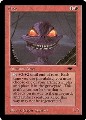
Cool reprint. Kinda wish it was the old art, but still!
EDH decks and themes I'm currently playing!
Show
Hide
Tresserhorn (zombies, check out my primer!]) | Roon (blink) | Vial Smasher+Thrasios (big dudes) | Marath (tokens) | Jhoira (artifacts) | Thassa (sea monsters)
Jodah (flavor text tribal) | Slivers/Atogs/Allies/Spirits (5c tribal modular) | Xantcha (group slug) | Gitrog (non-combo)
Zur (cycling) | Yennett (spyhinx control) | Geist (1v1) | Kamahl (1v1) | Grenzo (goblins) | Bolas (discard)
Kadena (morph) | Kenrith (legendary activated abilities) | Nethroi (reanimator) | Xyris (combat tricks) | Ayula (bears)
-
Guardman
 A Dog's Dream of Man
 - Posts: 1771
- Joined: 4 years ago
- Pronoun: he / him
- Location: In a Turn-Based World
You know what, I've been disappointed in the box topper art so far. And this one isn't even the art itself, but the framing. The fact that the janitor's head is cut-off and the entire thing looks like it is off-center really bothers me. It's at the same level as bad kerning. The usual reprint art is eh, fine, like always.
Luckily I still have my old bobs so I don't need to worry about either of the new(er) arts.
Luckily I still have my old bobs so I don't need to worry about either of the new(er) arts.
I don't know what "bad kerning" is, but given the context, I completely agree. This topper art just looks off.Guardman wrote: ↑3 years agoYou know what, I've been disappointed in the box topper art so far. And this one isn't even the art itself, but the framing. The fact that the janitor's head is cut-off and the entire thing looks like it is off-center really bothers me. It's at the same level as bad kerning.(emphasis added) The usual reprint art is eh, fine, like always.
Luckily I still have my old bobs so I don't need to worry about either of the new(er) arts.
EDH decks and themes I'm currently playing!
Show
Hide
Tresserhorn (zombies, check out my primer!]) | Roon (blink) | Vial Smasher+Thrasios (big dudes) | Marath (tokens) | Jhoira (artifacts) | Thassa (sea monsters)
Jodah (flavor text tribal) | Slivers/Atogs/Allies/Spirits (5c tribal modular) | Xantcha (group slug) | Gitrog (non-combo)
Zur (cycling) | Yennett (spyhinx control) | Geist (1v1) | Kamahl (1v1) | Grenzo (goblins) | Bolas (discard)
Kadena (morph) | Kenrith (legendary activated abilities) | Nethroi (reanimator) | Xyris (combat tricks) | Ayula (bears)
Jodah (flavor text tribal) | Slivers/Atogs/Allies/Spirits (5c tribal modular) | Xantcha (group slug) | Gitrog (non-combo)
Zur (cycling) | Yennett (spyhinx control) | Geist (1v1) | Kamahl (1v1) | Grenzo (goblins) | Bolas (discard)
Kadena (morph) | Kenrith (legendary activated abilities) | Nethroi (reanimator) | Xyris (combat tricks) | Ayula (bears)
-
Guardman A Dog's Dream of Man
- Posts: 1771
- Joined: 4 years ago
- Pronoun: he / him
- Location: In a Turn-Based World
From Wikipedia:Outcryqq wrote: ↑3 years agoI don't know what "bad kerning" is, but given the context, I completely agree. This topper art just looks off.Guardman wrote: ↑3 years agoYou know what, I've been disappointed in the box topper art so far. And this one isn't even the art itself, but the framing. The fact that the janitor's head is cut-off and the entire thing looks like it is off-center really bothers me. It's at the same level as bad kerning.(emphasis added) The usual reprint art is eh, fine, like always.
Luckily I still have my old bobs so I don't need to worry about either of the new(er) arts.
Wikipedia wrote:In typography, kerning is the process of adjusting the spacing between characters in a proportional font, usually to achieve a visually pleasing result. Kerning adjusts the space between individual letter forms, while tracking (letter-spacing) adjusts spacing uniformly over a range of characters. In a well-kerned font, the two-dimensional blank spaces between each pair of characters all have a visually similar area.
From xkcd:


-
CommanderMaster999
- Posts: 800
- Joined: 5 years ago
- Pronoun: Unlisted
-
motleyslayer

- Posts: 1127
- Joined: 5 years ago
- Pronoun: he / him
- Contact:
really cool reprint, I'm probably gonna have to grab a set of these since I foolishly moved my set a few years ago