ever buy a specific printing of a card just cos you prefer its layout? my fave frames are the special Future Sight frame, the showcase Eldraine frame for adventures and the original card frame from around FE/IA when the printing started to look appealingly formatted. the M20 creature tokens are really striking, too. Not as excited about the "extended art" printings but at least they push down the price of the standard versions of the card! would say they often strike me as transparent bling that don't necessarily look better than the original.
generally I'm excited by the trend towards visual card variation even if it drives collectors up the wall :))) it's fun to see a version of a card you've never before encountered and I don't mind if the slightly reduced recognition slows down the game a little.
yr thoughts on card frames/borders
-
folding_music
 glitter pen on my mana crypt
 - Posts: 2325
- Joined: 4 years ago
- Pronoun: they / them
-
The Fluff
 Le fou, c'est moi
 - Posts: 2405
- Joined: 4 years ago
- Pronoun: Unlisted
- Location: Gradius Home World
- Contact:
future sight frames are my favorite. I bought a few cards simply because they used that kind of frame.
AnimEVO 2020 - EFZ Tournament (english commentary) // Clearing 4 domain with Qiqi
want to play a control deck in modern, but don't have Jace or snapcaster? please come visit us at the Emeria thread
-
Perrodequeso
- Posts: 6
- Joined: 4 years ago
- Pronoun: Unlisted
Being as I've been playing since the dawn of time I have a special love for the old frames. I do understand the need for some of the features in the Eighth Edition frames so I tolerate them. I hate the Origins onward frames, the fact that the card's color doesn't entirely frame the card makes them look cheap, IMHO.
I hate the new Legendary frame, yuck!
I do love the Throne storybook frames(or whatever they are called). I'm also a fan of the filigree frames From the Kaladesh masterpieces. I'm neutral about the Future Sight weirdness.
I will always try to acquire a card's oldest printing unless the art rubs me the wrong way. Luminous Angel being the prime example. The original art is horrendous, where as the duel deck art is just fine.
I think it is a good thing that WOTC plays around with card frames. With certain mechanics, such as Miracle, it helps with quick identification. So even if I don't always like the result, the idea is sound.
-
The Fluff Le fou, c'est moi
- Posts: 2405
- Joined: 4 years ago
- Pronoun: Unlisted
- Location: Gradius Home World
- Contact:
original art of Luminous Angel looks like porn. New art is much better.
AnimEVO 2020 - EFZ Tournament (english commentary) // Clearing 4 domain with Qiqi
want to play a control deck in modern, but don't have Jace or snapcaster? please come visit us at the Emeria thread
-
motleyslayer

- Posts: 1127
- Joined: 4 years ago
- Pronoun: he / him
- Contact:
I'm not really a fan of masterpiece frames in general but I really like the showcase/story frames for adventure cards. The showcase seems super interesting to me. I kind of like the extended art planeswalkers get in packs
-
Shabbaman
 crying casual
 - Posts: 55
- Joined: 4 years ago
- Pronoun: Unlisted
- Location: Costa la Haya
- Contact:
I love the original frame. To me, that's the only proper frame. Modern/8th edition makes me think of Pokemon, and while I can appreciate that that might have a sentimental appeal to those a few years older than me, anything that reminds me of Pokemon certainly isn't a good thing. Especially artifacts are terrible, with Mirrodin as an artifact block being the lowest of the low. As it contrasts with 8th Edition frame M15 frame doesn't seem so bad to me.
“Our words are backed with OBLIVION STONE!" - Mahatma Gandhi
-
The Fluff Le fou, c'est moi
- Posts: 2405
- Joined: 4 years ago
- Pronoun: Unlisted
- Location: Gradius Home World
- Contact:
forgot to say. I also like the old frames. Using the timeshifted spike feeder instead of the more recent ones.
AnimEVO 2020 - EFZ Tournament (english commentary) // Clearing 4 domain with Qiqi
want to play a control deck in modern, but don't have Jace or snapcaster? please come visit us at the Emeria thread
-
motleyslayer
- Posts: 1127
- Joined: 4 years ago
- Pronoun: he / him
- Contact:
I really liked the Time Shifted frames too. I always tell myself I wanna start using old frame basics but get too lazy too look for them
-
RxPhantom
 Fully Vaxxed, Baby!
 - Posts: 1521
- Joined: 4 years ago
- Pronoun: Unlisted
- Location: Southern Maryland
I really like the M15 frame, actually. It looks more streamlined and sleek. 8th edition is fine, and the old frame is the worst, mainly because of how inconsistent the quality was in the old days. Really though, I don't have a very strong opinion on frames. I like them all to some degree.
When it comes to choosing between printings on a card, the main determining factor is art. After that, it's card text, i.e. I'd prefer to have the card with the most updated Oracle text. This doesn't come up very often, but it'll sometimes be more important than art if I'm ordering a card for my cube.
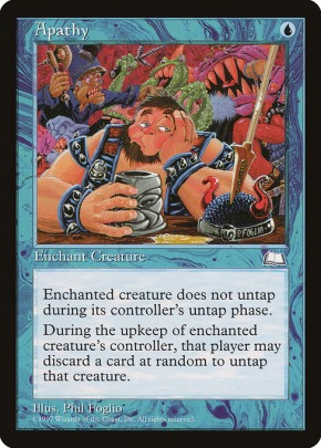
Side note, while I don't have any problem with new frames, I do wish they'd loosen the reins with the art. I miss the diversity of the old days, and I don't understand why it can't coexist with the hyper photo-realistic stuff.
I miss this kind of stuff:


When it comes to choosing between printings on a card, the main determining factor is art. After that, it's card text, i.e. I'd prefer to have the card with the most updated Oracle text. This doesn't come up very often, but it'll sometimes be more important than art if I'm ordering a card for my cube.
Side note, while I don't have any problem with new frames, I do wish they'd loosen the reins with the art. I miss the diversity of the old days, and I don't understand why it can't coexist with the hyper photo-realistic stuff.
I miss this kind of stuff:
Can you name all of the creature types with at least 20 cards? Try my Sporcle Quiz! Last Updated: 2/18/22 (Kamigawa: Neon Dynasty)
-
JaceBluesMaster

- Posts: 17
- Joined: 4 years ago
- Pronoun: he / him
I am a big fan of the black border extending upward to encompass the Artist information. That info was often very hard to read on older card frames.
I liked the 8th edition change to the Type line to make the background less busy, which makes it much easier to read (which held true for the latest frame). This is a personal preference but I like the way the type line is made to look like it is raised up above the frame.
I like the look and feel of the old school borders but they have so many qualities that make it difficult to read the text. I did enjoy the simplified OG card frame when they returned for the Timeshifted cards.
I love the new Legendary card frame mantle. I wish there was a way to squeeze it onto Planeswalker cards.
-
5colorsrainbow
- Posts: 591
- Joined: 4 years ago
- Pronoun: he / him
Well then you should be happy with the Secret Lairs having this as the theme.RxPhantom wrote: ↑4 years agoI really like the M15 frame, actually. It looks more streamlined and sleek. 8th edition is fine, and the old frame is the worst, mainly because of how inconsistent the quality was in the old days. Really though, I don't have a very strong opinion on frames. I like them all to some degree.
When it comes to choosing between printings on a card, the main determining factor is art. After that, it's card text, i.e. I'd prefer to have the card with the most updated Oracle text. This doesn't come up very often, but it'll sometimes be more important than art if I'm ordering a card for my cube.
Side note, while I don't have any problem with new frames, I do wish they'd loosen the reins with the art. I miss the diversity of the old days, and I don't understand why it can't coexist with the hyper photo-realistic stuff.
I miss this kind of stuff:
“There are no weak Jews. I am descended from those who wrestle angels and kill giants. We were chosen by God. You were chosen by a pathetic little man who can't seem to grow a full mustache"
-
RxPhantom Fully Vaxxed, Baby!
- Posts: 1521
- Joined: 4 years ago
- Pronoun: Unlisted
- Location: Southern Maryland
I'm not though. Secret Lairs haven't scratched that itch. None of them have been worth the asking price to me, and I'd rather support my LGS. The closest they've come is getting Richard Kane Ferguson for Blackblade Reforged in Gideon's Signature Spellbook. Still though, that was only a one-off. I want so many of the artists of yesteryear to start getting commissions again on a regular basis.5colorsrainbow wrote: ↑Well then you should be happy with the Secret Lairs having this as the theme.RxPhantom wrote: ↑4 years agoI really like the M15 frame, actually. It looks more streamlined and sleek. 8th edition is fine, and the old frame is the worst, mainly because of how inconsistent the quality was in the old days. Really though, I don't have a very strong opinion on frames. I like them all to some degree.
When it comes to choosing between printings on a card, the main determining factor is art. After that, it's card text, i.e. I'd prefer to have the card with the most updated Oracle text. This doesn't come up very often, but it'll sometimes be more important than art if I'm ordering a card for my cube.
Side note, while I don't have any problem with new frames, I do wish they'd loosen the reins with the art. I miss the diversity of the old days, and I don't understand why it can't coexist with the hyper photo-realistic stuff.
I miss this kind of stuff:
Can you name all of the creature types with at least 20 cards? Try my Sporcle Quiz! Last Updated: 2/18/22 (Kamigawa: Neon Dynasty)
-
5colorsrainbow
- Posts: 591
- Joined: 4 years ago
- Pronoun: he / him
If the want is more different art, then Secret Lairs provides that and while you dislike the art itself (ironic), price tag and/or system they show that wizard is opening to more experimental art.RxPhantom wrote: ↑I'm not though. Secret Lairs haven't scratched that itch. None of them have been worth the asking price to me, and I'd rather support my LGS. The closest they've come is getting Richard Kane Ferguson for Blackblade Reforged in Gideon's Signature Spellbook. Still though, that was only a one-off. I want so many of the artists of yesteryear to start getting commissions again on a regular basis.
“There are no weak Jews. I am descended from those who wrestle angels and kill giants. We were chosen by God. You were chosen by a pathetic little man who can't seem to grow a full mustache"

I liked the old border. I didn't really like the change they made in 8th edition, but have to say that the M15 border is a step up.
Same goes with the token frames. 8th edition to M15 (excluded) tokens really look bad with all that space wasted by the frame. M15 onwards are a step up, but the new "borderless" tokens we have now... Eh... Not my cup of tea. Especially when 1/2 to 1/3 the art is hidden behind the rulesbox and the remaining art is so zoomed in that you actually see less art than previous tokens.
Same goes with the token frames. 8th edition to M15 (excluded) tokens really look bad with all that space wasted by the frame. M15 onwards are a step up, but the new "borderless" tokens we have now... Eh... Not my cup of tea. Especially when 1/2 to 1/3 the art is hidden behind the rulesbox and the remaining art is so zoomed in that you actually see less art than previous tokens.
Angels Enthusiast
Avacyn, Casual Angel Tribal
Avacyn, Casual Angel Tribal
-
folding_music glitter pen on my mana crypt
- Posts: 2325
- Joined: 4 years ago
- Pronoun: they / them
thanks for all the comments hee. i was surprised, I thought more people would think the old frame was arcane and reminded them of beaten up cards with bad wording :3
PS, I grabbed a foiled Nyxie Callaphe yesterday and it's one of the most beautiful pieces of cardboard I've ever seen and scryfall says it's worth 20 cents. i'll never understand this lol
PS, I grabbed a foiled Nyxie Callaphe yesterday and it's one of the most beautiful pieces of cardboard I've ever seen and scryfall says it's worth 20 cents. i'll never understand this lol
-
clariwench
 Disgruntled Izzet
 - Posts: 106
- Joined: 4 years ago
- Pronoun: she / her
- Location: Ravnica
- Contact:
I absolutely pay more to not have the original frame or white bordered cards unless it's an absurd price increase. And I don't hate the Modern border by any means, but unless I'm after a specific watermark or the price is significantly different, I'll go for the M15 border because it's sleeker.
I can't believe the foil Showcase demi gods are so cheap! Definitely adding those five to my TCGplayer order. $1.46 for all five! My promo binder is large enough that I keep other cool stuff in it, like my Ral collection, 18 of the Japanese WAR planeswalkers, all of the MH1 art cards, and SCG tokens. The only ELD Showcase I bought was Fae of Wishes, but the frame is gorgeous.
I can't believe the foil Showcase demi gods are so cheap! Definitely adding those five to my TCGplayer order. $1.46 for all five! My promo binder is large enough that I keep other cool stuff in it, like my Ral collection, 18 of the Japanese WAR planeswalkers, all of the MH1 art cards, and SCG tokens. The only ELD Showcase I bought was Fae of Wishes, but the frame is gorgeous.
"Would that both gods above and demons below could protect me from good people. A man dubbed evil will take your purse, but a so-called ‘good man’ will not be content until he has ripped out your very heart.” - Davriel Cane, Children of the Nameless
Alchemy Mono Red Burn -- Historic Izzet Phoenix -- Historic Grixis Yorion Fires RIP -- Modern Burn -- Legacy Burn -- Grand Arbiter Augustin IV EDH -- Melek, Izzet Paragon EDH -- Kess, Dissident Mage EDH -- Jorn, God of Winter Brawl -- Gutmorn, Pactbound Servant Historic Brawl -- Chandra, Acolyte of Flame Historic Brawl -- Killian, Ink Duelist Historic Brawl -- Niv-Mizzet, Parun Historic Brawl
Alchemy Mono Red Burn -- Historic Izzet Phoenix -- Historic Grixis Yorion Fires RIP -- Modern Burn -- Legacy Burn -- Grand Arbiter Augustin IV EDH -- Melek, Izzet Paragon EDH -- Kess, Dissident Mage EDH -- Jorn, God of Winter Brawl -- Gutmorn, Pactbound Servant Historic Brawl -- Chandra, Acolyte of Flame Historic Brawl -- Killian, Ink Duelist Historic Brawl -- Niv-Mizzet, Parun Historic Brawl