Small list of minor nice-to-haves

User avatar
pokken
Posts: 6347
Joined: 4 years ago
Answers: 2
Pronoun: he / him

Post by pokken » 3 years ago

Just a completely unnecessary list of potential minor enhancements when boredom ensues.

ref primer: viewtopic.php?f=35&t=298

* Control over margin of header elements - I am noticing that particularly the "header" tag appears to have a bit of after-padding that makes some positioning. So you can't make the header touch the next element.

If you take a peek at the reference page you'll see how there's padding in between the big header and the next segment. I'm not 100% sure I want them to touch but I think it might look nice, especially if I ever get around to prettying up the banner image lol.

* Would adding a float attribute to boxes possibly be simpler than using the float tag, for most situations? I feel like |box float="right" | is a bit more parsimonious tag-wise than having a box with a float in it if you want a header for example.

* I noticed that cardimg tags of a certain feature seem to have some whitespace artifacts. You'll see the kinda white artifacts on the bottom right corner.

Code: Select all

[float=left][cardimg width=200 corners=4 shadow=4]Spellseeker[/cardimg][/float]
example:
could be I am doing something goofy there though.

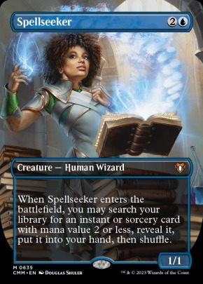
* Could we have tables? Or Autospreading divs like bootstrap grids? I find myself struggling with situations where I would like to have 3 boxes in one row that spread out on mobile. There might be a simple solution to that but what I find is I can get the left and the right column.

I can kinda force this by using exact percentages (e.g. two 25% boxes and a 50% box will sit side by side if you disable margins), but then they look wonky because of how theyf low on mobile.

An example of what I'm talking about is here with just two side-by-side elements that I would like to take up the full page and then on mobile to flow so that each element takes up the whole width. I tried using pixel sizing but it left the image not stretching all the way to the right side.

Code: Select all

[float="left" width="20%" padding="0" margin="0"]
[box border=0 corners="4" padding="5px" width="100%" style=fade color=powderblue header="Table of Contents" ]
[anchor goto=intro]Introduction[/anchor]
[anchor goto=why]Why Ephara?[/anchor]
[anchor goto=alternatives]Alternatives[/anchor]
[anchor goto=decklist]Decklist[/anchor]
[anchor goto=philosophy]Philosophy[/anchor]
[anchor goto=options]Card Options[/anchor]
[anchor goto=how]How to Play[/anchor]
[anchor goto=history]History[/anchor]
[anchor goto=other]Other Decks[/anchor]
[/box]
[/float]
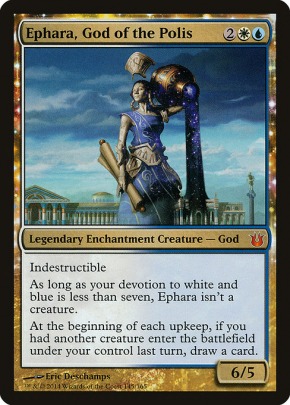
[image width="80%" padding="0" margin="0" title="Ephara, God of the Polis"]https://rpsands.com/image/mtg/ephara/ephara_banner.png[/image]
[clear]
Ephara, God of the Polis

User avatar
Feyd_Ruin
Elder Vampire
Posts: 5410
Joined: 5 years ago
Answers: 3
Pronoun: he / him
Contact:

Post by Feyd_Ruin » 3 years ago

pokken wrote:
3 years ago
* Control over margin of header elements - I am noticing that particularly the "header" tag appears to have a bit of after-padding that makes some positioning. So you can't make the header touch the next element.
Added.
margintop and marginbottom
Side effect: margin disappeared on any existing post. Editing and resaving will make the default 10px reappear.
* Would adding a float attribute to boxes possibly be simpler than using the float tag, for most situations?
Added.
pokken wrote:
3 years ago
* I noticed that cardimg tags of a certain feature seem to have some whitespace artifacts. You'll see the kinda white artifacts on the bottom right corner.
It's the "corners" you're using; not really fixable
Our card images don't have a transparent border, so if you change the corners, you can make them too square and show the white border on the edges.
* Could we have tables?
We already do, used with the [pipes] tag.
They don't have any real styling, though.
It's part of s9e, so there's not an easy way to add controls.
It always has a visible border, for instance.

I've thought about making a flexbox.
This might be better served for what you need.
Let me think on this one though.
To the beaten, the broken, or the damned; the lost, and the wayward: wherever I may be, you will have a home.

User avatar
pokken
Posts: 6347
Joined: 4 years ago
Answers: 2
Pronoun: he / him

Post by pokken » 3 years ago

It's possible you could just add a sizing parameter to the normal box tag that accepts the flex sizing. Thanks a ton!

User avatar
Feyd_Ruin
Elder Vampire
Posts: 5410
Joined: 5 years ago
Answers: 3
Pronoun: he / him
Contact:

Post by Feyd_Ruin » 3 years ago


Code: Select all

[flexbox maxwidth="800px" margin="0px"][box flex="none" border="0" corners="4" padding="5px" margin="0px" width="200px" style="fade" color="powderblue" header="Table of Contents" ]
[anchor goto=intro]Introduction[/anchor]
[anchor goto=why]Why Ephara?[/anchor]
[anchor goto=alternatives]Alternatives[/anchor]
[anchor goto=decklist]Decklist[/anchor]
[anchor goto=philosophy]Philosophy[/anchor]
[anchor goto=options]Card Options[/anchor]
[anchor goto=how]How to Play[/anchor]
[anchor goto=history]History[/anchor]
[anchor goto=other]Other Decks[/anchor]
[/box][box flex="1" border="0" margin="0px" width="auto" height="280px" bgimage="https://rpsands.com/image/mtg/ephara/ephara_banner.png" bgsize="cover"][nbsp][/box][/flexbox]
[flexbox] creates a flex container. width, maxwidth, height, and flex are options.
[flex=number] creates an invisible flex inner container.
[box] can now have flex=number and display=flex to become a flexbox container.
To the beaten, the broken, or the damned; the lost, and the wayward: wherever I may be, you will have a home.

User avatar
pokken
Posts: 6347
Joined: 4 years ago
Answers: 2
Pronoun: he / him

Post by pokken » 3 years ago

Feyd_Ruin wrote:
3 years ago

Code: Select all

[flexbox maxwidth="800px" margin="0px"][box flex="none" border="0" corners="4" padding="5px" margin="0px" width="200px" style="fade" color="powderblue" header="Table of Contents" ]
[anchor goto=intro]Introduction[/anchor]
[anchor goto=why]Why Ephara?[/anchor]
[anchor goto=alternatives]Alternatives[/anchor]
[anchor goto=decklist]Decklist[/anchor]
[anchor goto=philosophy]Philosophy[/anchor]
[anchor goto=options]Card Options[/anchor]
[anchor goto=how]How to Play[/anchor]
[anchor goto=history]History[/anchor]
[anchor goto=other]Other Decks[/anchor]
[/box][box flex="1" border="0" margin="0px" width="auto" height="280px" bgimage="https://rpsands.com/image/mtg/ephara/ephara_banner.png" bgsize="cover"][nbsp][/box][/flexbox]
[flexbox] creates a flex container. width, maxwidth, height, and flex are options.
[flex=number] creates an invisible flex inner container.
[box] can now have flex=number and display=flex to become a flexbox container.

I love this, gonna have to do some serious thinking about how to tune everything but I think this is a huge step forward in consistency between mobile and not if you're a div-nerd like me. Thanks so much!

User avatar
pokken
Posts: 6347
Joined: 4 years ago
Answers: 2
Pronoun: he / him

Post by pokken » 3 years ago

Feyd_Ruin wrote:
3 years ago

Code: Select all

[flexbox] creates a flex container. width, maxwidth, height, and flex are options.
[flex=number] creates an invisible flex inner container.
[box] can now have flex=number and display=flex to become a flexbox container.
Two things I'm noticing so far:

1) They do not seem to flow when the screen width is shrunk, which is what I'd expect (e.g. if you have a flex=3 and flex=9 next to each other, you'd expect the 9 to flow down below? Might be thinking of it wrong though.

2) Vertical-alignment seems a bit hit or miss, sometimes it's middle so if you have a tall element next to a shorter element the shorter element will align to the middle height of the taller one. Other times it aligns to the top and I'm not 100% sure what causes that.

The two examples I've tried thus far:


Replacing a float - note how the right box aligns to the middle of the left box.

Code: Select all

[header topcorners=4 bottomcorners=4 style="solid" color=powderblue marginbottom="10" ][anchor id=intro]Introduction[/anchor][/header]

[flexbox maxwidth="100%" width="auto" margin="0px" padding="0px"]

[flex=9]
Words in the 9 box
[/flex]

[flex=3]
[box width="100%" header="About Me" topcorners=4 bottomcorners=4 style=solid color=powderblue][align=left][size="75"]Words
[/box]

[/flex]
[/flexbox]

Introduction


The Azorius guild has a host of strong commanders for various archetypes, but up until recently there were not many Azorius creature decks. The guild typically played value creatures that interacted with non-creature spells (Auratouched Mage, Snapcaster Mage, Archaeomancer) or that draw you cards (Consecrated Sphinx, Sphinx of Uthuun). Creatures are very fragile in Commander, and often wind up being a liability if they don't generate value immediately or extreme value, and our guild in particular didn't have as many game busting creatures or the means to cast them as Green. Creatures that break the game open (e.g. Jin-Gitaxias, Core Augur) also are often prohibitively costed and tend to go either in reanimator or ramp strategies that Azorius is typically weaker at. So most Azorius decks leaned toward playing creatures that fuelled playing more non-creature spells.

As such, traditional Azorius decks in Commander have tended to be prison or control decks with lots of counterspells, sweepers, or lockdown pieces. The colors make it easy to dig out things like Winter Orb, and have a variety of very powerful board control, counterspells, and targeted removal spells.

With Ephara, God of the Polis and Brago, King Eternal we have two relatively new creatures that incentivize a much different style of Azorius play - though both are pretty different, they encourage playing a lot of guys. Since I really like creatures, but am also a huge fan of the Azorius guild, this is a pretty special time in Commander history for me.
About Me
I started at the dawn of Magic, sold everything, and bought back in 15 years later. Don't do that. I've played a bit of competitive Magic but find that most of what I love about the game is people. I live in NW Pennsylvania and play with a diverse and good sized playgroup at the local game stores as opposed to with the small regulated playgroup I began Commander with. I spend a lot of time thinking about theories of deck construction and build a lot more decks than I play.


The top header, banner, and TOC. Note how the TOC side is a bit smaller but seems to align to the top as expected, as does the image? Not exactly sure why that is. It's exactly what I would expect of course but not sure why it's different.

Code: Select all

[header style="solid" color=powderblue topcorners=20 bottomcorners=0 ][size=160]Ephara, God of the Polis - Flash & Taxes[/size][/header]

[flexbox maxwidth="100%" width="auto" margin="0px" padding="0px"]

[flex=2]
[header style="solid" color="powderblue" corners="4" margintop="0" marginbottom="0" padding="0"]Table of Contents[/header]
[anchor goto=intro]Introduction[/anchor]
[anchor goto=why]Why Ephara?[/anchor]
[anchor goto=alternatives]Alternatives[/anchor]
[anchor goto=decklist]Decklist[/anchor]
[anchor goto=philosophy]Philosophy[/anchor]
[anchor goto=options]Card Options[/anchor]
[anchor goto=how]How to Play[/anchor]
[anchor goto=history]History[/anchor]
[anchor goto=other]Other Decks[/anchor]
[/flex]
[flex=10]
[image width="100%" padding="0" margins="0 0 0 0" title="Ephara, God of the Polis"]https://rpsands.com/image/mtg/ephara/ephara_banner.jpg[/image]
[/flex]

[/flexbox]

Ephara, God of the Polis - Flash & Taxes


Annnywho I will find tons of uses for these as is so don't burn yourself out :) I really appreciate the work.
Last edited by pokken 3 years ago, edited 2 times in total.

User avatar
pokken
Posts: 6347
Joined: 4 years ago
Answers: 2
Pronoun: he / him

Post by pokken » 3 years ago

Honestly I think these look really damn good on mobile so I might be overthinking flowing. Going to experiment with redoing some of my other floats.

Edit: LOL sorry

The vertical align thing was a BR tag from me having a blank line after my flex tag. I'm dumb, and nevermind that.

All I had to do was inspect it and I saw there was no vertical alignment issue just a BR tag in there. Sorry!

User avatar
Feyd_Ruin
Elder Vampire
Posts: 5410
Joined: 5 years ago
Answers: 3
Pronoun: he / him
Contact:

Post by Feyd_Ruin » 3 years ago

lol. All good.

Flexbox specifically prevents anything from ever flowing down to the next line. Think of it like a table where each element is a cell. No matter how much you shrink, you're just forcing the cell size to change, never wrap.

The flex number for each is a comparative size number only. With two elements, for instance, 1 & 3 is the same as a 3 & 9. Either way you're saying element 1 should always be 1/3rd the size of element 2 (thus ending with 25% and 75%). A flex of 0 or "none" will force an element to be the same width and let the other elements flex their width.

Thus 4 elements of :
(width=100px, flex:none) (flex:1) (flex:3) (flex:4)

[flexbox][box flex=none corners=0 width=100px bg=#aaa margin=0px]100p[/box][box flex=1 corners=0 bg=#ff0 margin=0px width=auto]1[/box][box flex=3 corners=0 bg=#0f0 margin=0px width=auto]3[/box][box flex=4 corners=0 bg=#0ff margin=0px width=auto]4[/box][/flexbox]

100p
1
3
4


Max sure to have width=auto on boxes that flex, otherwise the default pixel width will prevent it from flexing right.
:)
To the beaten, the broken, or the damned; the lost, and the wayward: wherever I may be, you will have a home.

Post Reply Previous topicNext topic

Return to “Community Software Feedback and Bug Reports”