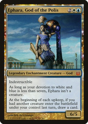
I had to double check - yes there are 5 different styles within MH2 (though not every card has every option ofc).
Since polls don't allow ranked choice, post your order of preference below. I'm really curious what people think of the playtest versions in particular - I'm generally down with the art, but I don't like the frame (especially the smudgy set symbol) and I really don't like the art direction flavor text, so overall it's a miss for me, although there are some really cool ones like Serra's Emissary.
Rank the MH2 styles
-
DirkGently
 My wins are unconditional
 - Posts: 4578
- Joined: 4 years ago
- Pronoun: he / him
Perm Decks
Phelddagrif - Kaervek - Golos - Zirilan
Flux Decks
Gollum - Lobelia - Minthara - Plargg2 - Solphim - Otharri - Graaz - Ratchet - Soundwave - Slicer - Gale - Rootha - Kagemaro - Blorpityblorpboop - Kayla - SliverQueen - Ivy - Falco - Gluntch - Charlatan/Wilson - Garth - Kros - Anthousa - Shigeki - Light-Paws - Lukka - Sefris - Ebondeath - Rokiric - Garth - Nixilis - Grist - Mavinda - Kumano - Nezahal - Mavinda - Plargg - Plargg - Extus - Plargg - Oracle - Kardur - Halvar - Tergrid - Egon - Cosima - Halana+Livio - Jeska+Falthis+Obosh - Yeva - Akiri+Zirda - Lady Sun - Nahiri - Korlash - Overlord+Zirda - Chisei - Athreos2 - Akim - Cazur+Ukkima - Otrimi - Otrimi - Kalamax - Ayli+Lurrus - Clamilton - Gonti - Heliod2 - Ayula - Thassa2 - Gallia - Purphoros2 - Rankle - Uro - Rayami - Gargos - Thrasios+Bruse - Pang - Sasaya - Wydwen - Feather - Rona - Toshiro - Sylvia+Khorvath - Geth - QMarchesa - Firesong - Athreos - Arixmethes - Isperia - Etali - Silas+Sidar - Saskia - Virtus+Gorm - Kynaios - Naban - Aryel - Mizzix - Kazuul - Tymna+Kraum - Sidar+Tymna - Ayli - Gwendlyn - Phelddagrif - Liliana - Kaervek - Phelddagrif - Mairsil - Scarab - Child - Phenax - Shirei - Thada - Depala - Circu - Kytheon - GrenzoHR - Phelddagrif - Reyhan+Kraum - Toshiro - Varolz - Nin - Ojutai - Tasigur - Zedruu - Uril - Edric - Wort - Zurgo - Nahiri - Grenzo - Kozilek - Yisan - Ink-Treader - Yisan - Brago - Sidisi - Toshiro - Alexi - Sygg - Brimaz - Sek'Kuar - Marchesa - Vish Kal - Iroas - Phelddagrif - Ephara - Derevi - Glissa - Wanderer - Saffi - Melek - Xiahou Dun - Lazav - Lin Sivvi - Zirilan - Glissa - Ashling1 - Angus - Arcum - Talrand - Chainer - Higure - Kumano - Scion - Teferi1 - Uyo - Sisters
PDH - Drake - Graverobber - Izzet GM - Tallowisp - Symbiote
Brawl - Feather - Ugin - Jace - Scarab - Angrath - Vraska - Kumena
Oathbreaker - Wrenn&6

-
kirkusjonesDisciple of Dumb
- Posts: 738
- Joined: 4 years ago
- Pronoun: Unlisted
Old frames, all the way. The nostalgia bomb is just too strong for me. My friends and I have joked about rubberbanding a stack of the old frame cards and tossing them in a backpack for a week for maximum old school feel.
Grismold - The Legend of the Cheekclapper - Read Pokken’s review here
Erinis and Scion of Halaster - Live, Laugh, Loam
Erinis and Scion of Halaster - Live, Laugh, Loam
Nah, I'm cool with the alt arts/frames sucking up pack value so I can buy boring old normal arts/ unpopular alts at lower prices than I'd be able to if there weren't chase alts sucking up pack value.BeneTleilax wrote: ↑2 years agoJust give us the regular cards. All this alt art and alt frames is just a cash grab and a gimmick.
-
TheAmericanSpirit
 Supreme Dumb Guy
 - Posts: 2202
- Joined: 4 years ago
- Pronoun: he / him
- Location: IGMCULSL Papal Palace
The playtest versions appeal to me greatly. The abstraction of the playtest Dress Down in particular I find very pretty for some reason. I think it's largely because most of them are such stark contrasts to the airbrushed "final draft" digital art and the lack of artistic consistency reminds me of the days before homogenized art direction.
But admittedly, my taste in art leans away from quote-unquote perfection anyway.
Edit: the old border does nothing for me. I never thought they needed to change in 8th edition in the first place, but backtracking design for popular demand strikes me as a fickle move. Make a move and commit.
But admittedly, my taste in art leans away from quote-unquote perfection anyway.
Edit: the old border does nothing for me. I never thought they needed to change in 8th edition in the first place, but backtracking design for popular demand strikes me as a fickle move. Make a move and commit.
Last edited by TheAmericanSpirit 2 years ago, edited 2 times in total.
There's no biscuits and gravy in New Zealand.
(Except when DirkGently makes them!)
(Except when DirkGently makes them!)

I am evaluating based on the underlying card. Sythis and Dress Down look great with the play-test art. I think squirrels work best in retro frame, but I like Chatterfang's alt art more.
I pulled a retro border Vile Entomber and Rishadan Dockhand……but these FEEL like homages so much that I wish I just had regular, current borders for them (since they immediately register as Time Spiral/MH-type cards).
I pulled a retro border Vile Entomber and Rishadan Dockhand……but these FEEL like homages so much that I wish I just had regular, current borders for them (since they immediately register as Time Spiral/MH-type cards).
Mirri, Cat Warrior counts as a Cat Warrior.
-
Sanity_Eclipse

- Posts: 321
- Joined: 4 years ago
- Pronoun: he / him
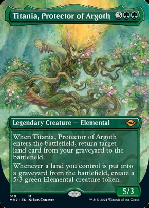
Full Alt Art was my vote (ie new art Titania). Full Art, Regular and then Old Border tied, in a 35/35/30 kinda way if that makes sense. Old border isn't necessarily bad to me, it just doesn't work on every card IMO.
The playtest style is my least favorite in this set. I love the BTS info and art direction and the rough drafts etc, just not on cards. Give us a website link with artist proofs or something more like that.
Edited for clarity and revised thinking.
The playtest style is my least favorite in this set. I love the BTS info and art direction and the rough drafts etc, just not on cards. Give us a website link with artist proofs or something more like that.
Edited for clarity and revised thinking.
Last edited by Sanity_Eclipse 2 years ago, edited 1 time in total.


I think it varies from card to card for me. Some retro frames (like Tourach, Dread Cantor and Asmoranomardicadaistinaculdacar) are important to me because they're originally referenced on old-frame cards. But, like retro-frame Damn? Meaningless.
Some of the playtest-style cards are cool, but some like Road//Ruin seem basically blank.
Some of the playtest-style cards are cool, but some like Road//Ruin seem basically blank.
I mostly dislike the playtest-style cards. They just look shoddy and unfinished to me.
I have 68 active EDH decks, with more in progress. I don't consider this a problem. Do you?
I am also one of those barbarians who enjoys winning by turning creatures sideways.
I am also one of those barbarians who enjoys winning by turning creatures sideways.
-
Guardman
 A Dog's Dream of Man
 - Posts: 1729
- Joined: 4 years ago
- Pronoun: he / him
- Location: In a Turn-Based World
The playtest style is by far my favorite in the set and probably one of my favorite alternate styles (right up there with Throne of Eldrain's Storybook style). I really like seeing the artist sketch and how different artists do things differently. Plus finding the subtle differences (like the playtest version of Timeless Witness has a wolf instead of a hyena). Add the fact that the flavor text is the art director's notes and *chef's kiss*.
-
DirkGently My wins are unconditional
- Posts: 4578
- Joined: 4 years ago
- Pronoun: he / him
One thing that annoys me about new-old-border cards is when they have new templating, like the TSR Mystic Confluence. Bullet points on an old border card just look wrong to me.Sinis wrote: ↑2 years agoI think it varies from card to card for me. Some retro frames (like Tourach, Dread Cantor and Asmoranomardicadaistinaculdacar) are important to me because they're originally referenced on old-frame cards. But, like retro-frame Damn? Meaningless.
And it's even weirder with Carth the Lion, that symbol doesn't look right anywhere.
Perm Decks
Phelddagrif - Kaervek - Golos - Zirilan
Flux Decks
Gollum - Lobelia - Minthara - Plargg2 - Solphim - Otharri - Graaz - Ratchet - Soundwave - Slicer - Gale - Rootha - Kagemaro - Blorpityblorpboop - Kayla - SliverQueen - Ivy - Falco - Gluntch - Charlatan/Wilson - Garth - Kros - Anthousa - Shigeki - Light-Paws - Lukka - Sefris - Ebondeath - Rokiric - Garth - Nixilis - Grist - Mavinda - Kumano - Nezahal - Mavinda - Plargg - Plargg - Extus - Plargg - Oracle - Kardur - Halvar - Tergrid - Egon - Cosima - Halana+Livio - Jeska+Falthis+Obosh - Yeva - Akiri+Zirda - Lady Sun - Nahiri - Korlash - Overlord+Zirda - Chisei - Athreos2 - Akim - Cazur+Ukkima - Otrimi - Otrimi - Kalamax - Ayli+Lurrus - Clamilton - Gonti - Heliod2 - Ayula - Thassa2 - Gallia - Purphoros2 - Rankle - Uro - Rayami - Gargos - Thrasios+Bruse - Pang - Sasaya - Wydwen - Feather - Rona - Toshiro - Sylvia+Khorvath - Geth - QMarchesa - Firesong - Athreos - Arixmethes - Isperia - Etali - Silas+Sidar - Saskia - Virtus+Gorm - Kynaios - Naban - Aryel - Mizzix - Kazuul - Tymna+Kraum - Sidar+Tymna - Ayli - Gwendlyn - Phelddagrif - Liliana - Kaervek - Phelddagrif - Mairsil - Scarab - Child - Phenax - Shirei - Thada - Depala - Circu - Kytheon - GrenzoHR - Phelddagrif - Reyhan+Kraum - Toshiro - Varolz - Nin - Ojutai - Tasigur - Zedruu - Uril - Edric - Wort - Zurgo - Nahiri - Grenzo - Kozilek - Yisan - Ink-Treader - Yisan - Brago - Sidisi - Toshiro - Alexi - Sygg - Brimaz - Sek'Kuar - Marchesa - Vish Kal - Iroas - Phelddagrif - Ephara - Derevi - Glissa - Wanderer - Saffi - Melek - Xiahou Dun - Lazav - Lin Sivvi - Zirilan - Glissa - Ashling1 - Angus - Arcum - Talrand - Chainer - Higure - Kumano - Scion - Teferi1 - Uyo - Sisters
PDH - Drake - Graverobber - Izzet GM - Tallowisp - Symbiote
Brawl - Feather - Ugin - Jace - Scarab - Angrath - Vraska - Kumena
Oathbreaker - Wrenn&6
Phelddagrif - Kaervek - Golos - Zirilan
Flux Decks
Gollum - Lobelia - Minthara - Plargg2 - Solphim - Otharri - Graaz - Ratchet - Soundwave - Slicer - Gale - Rootha - Kagemaro - Blorpityblorpboop - Kayla - SliverQueen - Ivy - Falco - Gluntch - Charlatan/Wilson - Garth - Kros - Anthousa - Shigeki - Light-Paws - Lukka - Sefris - Ebondeath - Rokiric - Garth - Nixilis - Grist - Mavinda - Kumano - Nezahal - Mavinda - Plargg - Plargg - Extus - Plargg - Oracle - Kardur - Halvar - Tergrid - Egon - Cosima - Halana+Livio - Jeska+Falthis+Obosh - Yeva - Akiri+Zirda - Lady Sun - Nahiri - Korlash - Overlord+Zirda - Chisei - Athreos2 - Akim - Cazur+Ukkima - Otrimi - Otrimi - Kalamax - Ayli+Lurrus - Clamilton - Gonti - Heliod2 - Ayula - Thassa2 - Gallia - Purphoros2 - Rankle - Uro - Rayami - Gargos - Thrasios+Bruse - Pang - Sasaya - Wydwen - Feather - Rona - Toshiro - Sylvia+Khorvath - Geth - QMarchesa - Firesong - Athreos - Arixmethes - Isperia - Etali - Silas+Sidar - Saskia - Virtus+Gorm - Kynaios - Naban - Aryel - Mizzix - Kazuul - Tymna+Kraum - Sidar+Tymna - Ayli - Gwendlyn - Phelddagrif - Liliana - Kaervek - Phelddagrif - Mairsil - Scarab - Child - Phenax - Shirei - Thada - Depala - Circu - Kytheon - GrenzoHR - Phelddagrif - Reyhan+Kraum - Toshiro - Varolz - Nin - Ojutai - Tasigur - Zedruu - Uril - Edric - Wort - Zurgo - Nahiri - Grenzo - Kozilek - Yisan - Ink-Treader - Yisan - Brago - Sidisi - Toshiro - Alexi - Sygg - Brimaz - Sek'Kuar - Marchesa - Vish Kal - Iroas - Phelddagrif - Ephara - Derevi - Glissa - Wanderer - Saffi - Melek - Xiahou Dun - Lazav - Lin Sivvi - Zirilan - Glissa - Ashling1 - Angus - Arcum - Talrand - Chainer - Higure - Kumano - Scion - Teferi1 - Uyo - Sisters
PDH - Drake - Graverobber - Izzet GM - Tallowisp - Symbiote
Brawl - Feather - Ugin - Jace - Scarab - Angrath - Vraska - Kumena
Oathbreaker - Wrenn&6
-
PrimevalCommander
- Posts: 890
- Joined: 4 years ago
- Pronoun: he / him
I voted Full Art Regular. Alternate are are highly variable and I only go after very few alternate art cards.
I prefer Full Art Foils, however I rarely spring for them due to the high price. I can get plain art foils for the same price as the non-foils, so that is typically the way I go. Occasionally I'll go for the full art foil on cheap cards that don't spike the price so much. Anything popular quickly rises outside what I am willing to pay for the most premium printings.
I prefer Full Art Foils, however I rarely spring for them due to the high price. I can get plain art foils for the same price as the non-foils, so that is typically the way I go. Occasionally I'll go for the full art foil on cheap cards that don't spike the price so much. Anything popular quickly rises outside what I am willing to pay for the most premium printings.
Decklists
God-Eternal Oketra
Titania, Protector of Argoth
Karador, Ghost Chieftan
Kalamax, the Stormsire
Rocco WILD PAIR
Sefris of the Hidden Ways *Budget*(Page 4)
Zurzoth, Chaos RiderKalamax, the Stormsire
Rocco WILD PAIR
Sefris of the Hidden Ways *Budget*(Page 4)
God-Eternal Oketra
Titania, Protector of Argoth
-
folding_music
 glitter pen on my mana crypt
 - Posts: 2254
- Joined: 4 years ago
- Pronoun: they / them
the oldschool frames dont really work for me, and I love the original sets. looking at one of them makes me feel bad in a way I can't quite describe, and exclusively seeing big dumb EDH staples in it makes me long for underpowered casual. the old frame to me represents a billion naive but pioneering variants of chaos magic which arrived and departed too quickly to offer targetable demographics - we weren't Spikes, Johnnys, Timmies and Vorthoses so much as just a merry band of dumbasses with no talent in card assessment or any ambition to do the best version of whatever thing. with the old borders my ambitions were only to throw together a pile of cards that'd make the other players at the table laugh or enjoy themselves somehow; too many boring guides have crossed my eyes since then and I feel like only the past version of myself deserves the oldschool frames, somehow? I actually hate them and I hate Modern Horizons 2 for being heavy-handed and op. sorry to soapbox giggle
Printing cards straight into eternal formats is the cash grab.BeneTleilax wrote: ↑2 years agoJust give us the regular cards. All this alt art and alt frames is just a cash grab and a gimmick.
Alternate Art and good-borders are not. They're what players actually want.
-
capitacommunist

- Posts: 88
- Joined: 4 years ago
- Pronoun: Unlisted
By far the old borders, followed by the full art alternate and the sketch cards. I wish they had not gone for etched foils in addition to the regular ones. The etched old border foils don't look bad, but they look much worse than the normal foil ones.
Some of the sketch cards look quite good, Urza's Saga for example is really nice.
Some of the sketch cards look quite good, Urza's Saga for example is really nice.
I like the sketch cards fairly well but it's all old border for me, especially on black cards and artifacts.
I cracked an old bordered Sword of Hearth and Home and it really spoke to me.
I cracked an old bordered Sword of Hearth and Home and it really spoke to me.


Old border is the best. They never should have changed it. I want to like the sketches but they have a faux patina about them that makes them feel tryhard.
“Comboing in Commander is like dunking on a seven foot hoop.” – Dana Roach
“Making a deck that other people want to play against – that’s Commander.” – Gavin Duggan
"I want my brain to win games, not my cards." – Sheldon Menery
“Making a deck that other people want to play against – that’s Commander.” – Gavin Duggan
"I want my brain to win games, not my cards." – Sheldon Menery
-
DirkGently My wins are unconditional
- Posts: 4578
- Joined: 4 years ago
- Pronoun: he / him
I honestly haaaate the art direction text.
What the hell is the point of the word before the colon? Why does Rokiric's and Sythis's seem like basically the same thing, but one says "action" and one says "appearance"? How is a man a "mood" on Garth? And while some are fine even if a bit obvious, like ignoble hierarch and timeless witness, some are just honestly stupid, just a description of what the card does, or the name of the character with very little physical description. Were those the most interesting art directions they had to choose from? Whoever has that job is getting paid way too much.
Perm Decks
Phelddagrif - Kaervek - Golos - Zirilan
Flux Decks
Gollum - Lobelia - Minthara - Plargg2 - Solphim - Otharri - Graaz - Ratchet - Soundwave - Slicer - Gale - Rootha - Kagemaro - Blorpityblorpboop - Kayla - SliverQueen - Ivy - Falco - Gluntch - Charlatan/Wilson - Garth - Kros - Anthousa - Shigeki - Light-Paws - Lukka - Sefris - Ebondeath - Rokiric - Garth - Nixilis - Grist - Mavinda - Kumano - Nezahal - Mavinda - Plargg - Plargg - Extus - Plargg - Oracle - Kardur - Halvar - Tergrid - Egon - Cosima - Halana+Livio - Jeska+Falthis+Obosh - Yeva - Akiri+Zirda - Lady Sun - Nahiri - Korlash - Overlord+Zirda - Chisei - Athreos2 - Akim - Cazur+Ukkima - Otrimi - Otrimi - Kalamax - Ayli+Lurrus - Clamilton - Gonti - Heliod2 - Ayula - Thassa2 - Gallia - Purphoros2 - Rankle - Uro - Rayami - Gargos - Thrasios+Bruse - Pang - Sasaya - Wydwen - Feather - Rona - Toshiro - Sylvia+Khorvath - Geth - QMarchesa - Firesong - Athreos - Arixmethes - Isperia - Etali - Silas+Sidar - Saskia - Virtus+Gorm - Kynaios - Naban - Aryel - Mizzix - Kazuul - Tymna+Kraum - Sidar+Tymna - Ayli - Gwendlyn - Phelddagrif - Liliana - Kaervek - Phelddagrif - Mairsil - Scarab - Child - Phenax - Shirei - Thada - Depala - Circu - Kytheon - GrenzoHR - Phelddagrif - Reyhan+Kraum - Toshiro - Varolz - Nin - Ojutai - Tasigur - Zedruu - Uril - Edric - Wort - Zurgo - Nahiri - Grenzo - Kozilek - Yisan - Ink-Treader - Yisan - Brago - Sidisi - Toshiro - Alexi - Sygg - Brimaz - Sek'Kuar - Marchesa - Vish Kal - Iroas - Phelddagrif - Ephara - Derevi - Glissa - Wanderer - Saffi - Melek - Xiahou Dun - Lazav - Lin Sivvi - Zirilan - Glissa - Ashling1 - Angus - Arcum - Talrand - Chainer - Higure - Kumano - Scion - Teferi1 - Uyo - Sisters
PDH - Drake - Graverobber - Izzet GM - Tallowisp - Symbiote
Brawl - Feather - Ugin - Jace - Scarab - Angrath - Vraska - Kumena
Oathbreaker - Wrenn&6
Phelddagrif - Kaervek - Golos - Zirilan
Flux Decks
Gollum - Lobelia - Minthara - Plargg2 - Solphim - Otharri - Graaz - Ratchet - Soundwave - Slicer - Gale - Rootha - Kagemaro - Blorpityblorpboop - Kayla - SliverQueen - Ivy - Falco - Gluntch - Charlatan/Wilson - Garth - Kros - Anthousa - Shigeki - Light-Paws - Lukka - Sefris - Ebondeath - Rokiric - Garth - Nixilis - Grist - Mavinda - Kumano - Nezahal - Mavinda - Plargg - Plargg - Extus - Plargg - Oracle - Kardur - Halvar - Tergrid - Egon - Cosima - Halana+Livio - Jeska+Falthis+Obosh - Yeva - Akiri+Zirda - Lady Sun - Nahiri - Korlash - Overlord+Zirda - Chisei - Athreos2 - Akim - Cazur+Ukkima - Otrimi - Otrimi - Kalamax - Ayli+Lurrus - Clamilton - Gonti - Heliod2 - Ayula - Thassa2 - Gallia - Purphoros2 - Rankle - Uro - Rayami - Gargos - Thrasios+Bruse - Pang - Sasaya - Wydwen - Feather - Rona - Toshiro - Sylvia+Khorvath - Geth - QMarchesa - Firesong - Athreos - Arixmethes - Isperia - Etali - Silas+Sidar - Saskia - Virtus+Gorm - Kynaios - Naban - Aryel - Mizzix - Kazuul - Tymna+Kraum - Sidar+Tymna - Ayli - Gwendlyn - Phelddagrif - Liliana - Kaervek - Phelddagrif - Mairsil - Scarab - Child - Phenax - Shirei - Thada - Depala - Circu - Kytheon - GrenzoHR - Phelddagrif - Reyhan+Kraum - Toshiro - Varolz - Nin - Ojutai - Tasigur - Zedruu - Uril - Edric - Wort - Zurgo - Nahiri - Grenzo - Kozilek - Yisan - Ink-Treader - Yisan - Brago - Sidisi - Toshiro - Alexi - Sygg - Brimaz - Sek'Kuar - Marchesa - Vish Kal - Iroas - Phelddagrif - Ephara - Derevi - Glissa - Wanderer - Saffi - Melek - Xiahou Dun - Lazav - Lin Sivvi - Zirilan - Glissa - Ashling1 - Angus - Arcum - Talrand - Chainer - Higure - Kumano - Scion - Teferi1 - Uyo - Sisters
PDH - Drake - Graverobber - Izzet GM - Tallowisp - Symbiote
Brawl - Feather - Ugin - Jace - Scarab - Angrath - Vraska - Kumena
Oathbreaker - Wrenn&6
-
Guardman A Dog's Dream of Man
- Posts: 1729
- Joined: 4 years ago
- Pronoun: he / him
- Location: In a Turn-Based World
I actually really liked the art direction text. I found it interesting to see what mood, action, etc. they wanted the artist going for with the card. And I appreciated that they kept it same as an actual art direction by keeping in the section titles like "mood" and "action".DirkGently wrote: ↑2 years agoI honestly haaaate the art direction text.
What the hell is the point of the word before the colon? Why does Rokiric's and Sythis's seem like basically the same thing, but one says "action" and one says "appearance"? How is a man a "mood" on Garth? And while some are fine even if a bit obvious, like ignoble hierarch and timeless witness, some are just honestly stupid, just a description of what the card does, or the name of the character with very little physical description. Were those the most interesting art directions they had to choose from? Whoever has that job is getting paid way too much.
I will say doing a little art direction myself in my job (though it was in relation to video editing and shooting drone videos) that coming up with little prompts that the person creating your art can use is harder than it looks as it is a fine line between clearly stating what you want while not overloading them with info. This would be even more so with something like a painting since the reason you presumably chose this person is that you think their art style is a good fit for what you want and you don't want to backseat paint so that you lose what you were looking for.
I will give you that Synthis' showcase text doesn't look very much like an action and more like appearance. The only thing I can think of their is that the (p. 26) mentioned in the text was a reference to the action they were looking for.